Author: Brian H. Black D.O.

  • NYHA in Hospice: Turning Breathlessness into Shared Language

    NYHA in Hospice: Turning Breathlessness into Shared Language


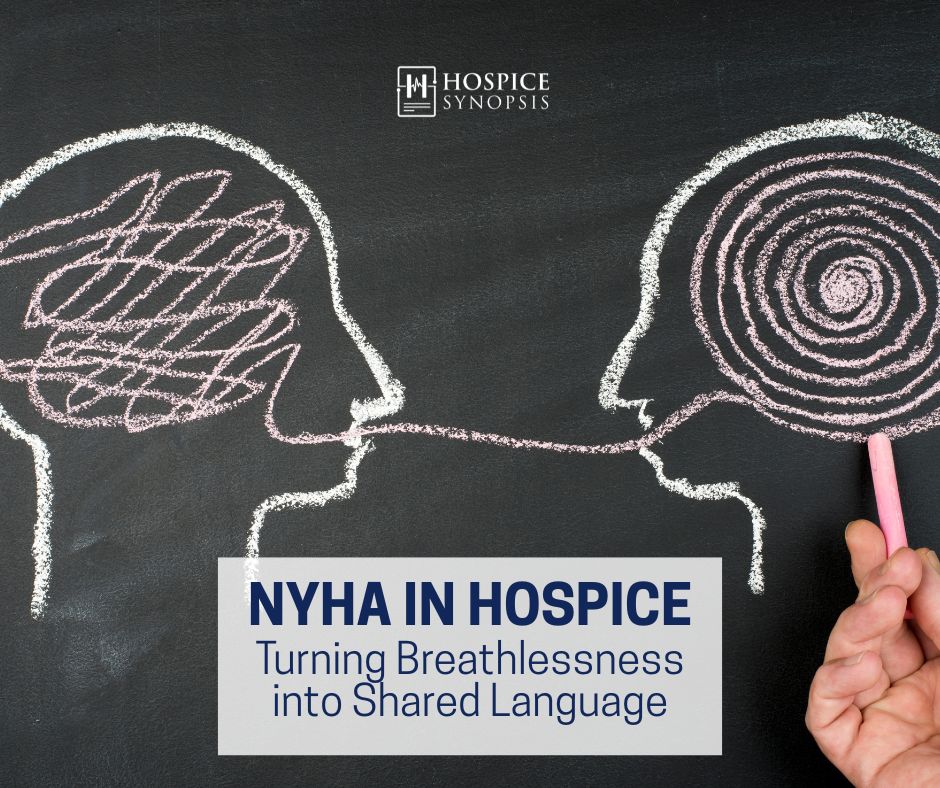
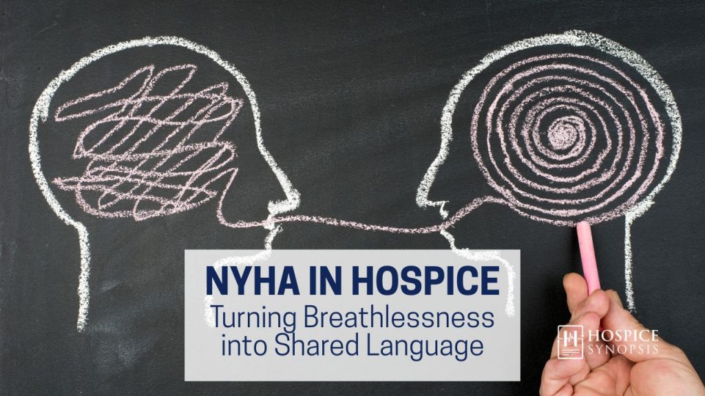
    The NYHA Still Matters

    Every hospice nurse knows the moment: the patient gasps two steps after standing, already on oxygen, swollen despite diuretics, worsening each week. Families call it weakness. Hospitals call it criteria. We should name it New York Heart Scale (NYHA) Class IV with clinical clarity.

    “NYHA Class IV” alone in the chart invites denials, audits, and mistrust. It was never a checkbox. Paired with PPS ≤40% and functional decline, it tells a tale. Without context, it erases that story and costs patients’ care. Much like other metrics that matter, NYHA remains essential in hospice: not a number, but a narrative of breath and function. It’s all about the score plus the story.


    Case Example

    Mr. Lowe, 78, a retired truck driver, had severe heart failure. His EF sat near 30%. His daughter asked, “Does that number mean he qualifies for hospice?”

    What mattered wasn’t just a static EF. He became short of breath just pulling on his socks. He had two hospitalizations in 60 days. He had 10lbs of fluid gain, despite diuretics.

    EF didn’t tell that story. However, NYHA classified it as Class IV, with symptoms present at rest. Paired with PPS 40% and documented declines. The record was clear, defensible, and compassionate. His daughter finally understood: “his heart can’t get him through the day anymore.” She was right, it’s not just about numbers. 


    The Essentials

    Definition. NYHA is a four-class system quantifying functional limits in heart failure:

    • Class I: No symptoms with ordinary activity
    • Class II: Symptoms with ordinary activity
    • Class III: Symptoms with less-than-ordinary activity
    • Class IV: Symptoms at rest

    Nature. NYHA is subjective. It depends on clinician judgment, patient report, and observed capacity. It predicts mortality, but reproducibility suffers from interobserver variability.

    Theme. NYHA is essential but insufficient. Alone it misleads. In context it clarifies.

    Application. “Symptoms at rest” is the textbook line, but Class IV is broader:

    • Minimal effort counts. Even standing, dressing, or talking may trigger symptoms.
    • Not just dyspnea. Fatigue, palpitations, and angina also qualify.
    • Fluid symptoms count. Orthopnea, paroxysmal nocturnal dyspnea, bendopenia.
    • Dynamic status. Patients may fluctuate between III and IV; document the worst functional state.
    • Prognosis. Class IV signals poor survival, but hospice eligibility still requires PPS ≤40%, weight loss, or hospitalizations.

    At the bedside, Class IV means:

    • “Patient breathless pulling on socks.”
    • “Requires chair after 10–15 feet.”
    • “Needs 2–3 pillows to sleep.”

    NYHA IV should always be written as lived narrative, not just noted simply as “at rest.”


    History

    NYHA classification first appeared in 1928, refined in 1964 and 1994. Why has it lasted nearly a century? Not for perfection. It is subjective and inconsistent. It lasted because it is simple, human, and functional.

    Before PPS or ECOG, cardiology needed a way to say what patients could do and what they could not. NYHA gave that answer. Hospice inherits the same need: a language of limitation understood in the clinic, in the living room, and in audits.


    Clinical Relevance

    In advanced heart failure, NYHA still provides clarity:

    • Class IV signals serious limitation, usually with PPS <50%.
    • CMS LCDs cite NYHA IV plus decline markers: hospitalizations, EF <20%, weight loss.
    • Ejection Fraction (EF) is often a lagging indicator. Echo numbers may look stable or go unmeasured while patients continue to decline. Functional change over time always carries more prognostic weight.
    • Families and physicians outside hospice know the scale, making it a bridge between worlds.
    • Scope: Validated in HF and valvular disease, sometimes in congenital or right-sided failure. For non-cardiac illness, use tools like PPS or FAST.

    Used wisely, NYHA supports eligibility, teaches teams, and reassures families that what they see is real.


    Interdisciplinary Voice

    What each discipline brings to NYHA:

    • Nurse: Record distance and recovery. “Needs two rests in 15 feet.”
    • Social Worker: Capture role loss. “Stopped grocery shopping due to breathlessness.”
    • Chaplain: Note spiritual or community loss. “Unable to attend church after 50 years.”
    • Physician/NP/PA: Synthesize. “NYHA IV, PPS 40%, 5% weight loss, two CHF admissions, decline consistent with terminal heart failure.”

    In IDG, NYHA language should not sit only in the physician’s note. When nurses, social workers, and chaplains mention the same functional language: dyspneic at rest, limited to 10 feet. Then whole record speaks with one voice.


    Number + Narrative

    NYHA should always be Number + Narrative.

    • Number: Class I–IV
    • Narrative: Functional loss proving the class

    Examples:

    • “NYHA IV, dyspneic at rest, PPS 40%, two CHF admissions, 5% weight loss in 3 months.”
    • “Paused twice in 10 feet, needed chair after 20 seconds standing.”

    Pair with PPS and weight trends to strengthen eligibility notes. Never rely on EF alone. Function carries more prognostic weight.


    Beyond Self-Report: Anchors That Hold

    NYHA is subjective. Frail or cognitively impaired patients may understate symptoms or forget limits. To anchor classification:

    • Use proxy reports from caregivers.
    • Document observed tasks: “Paused twice in 10 feet, needed chair after 20 seconds standing.”
    • Add objective tools: PPS, FAST, etc…

    Anchors improve reproducibility and strengthen eligibility notes.


    Blind Spots and Misuse

    • Equating EF with prognosis: Low EF alone does not qualify. Function drives prognosis.
    • Confusing PPS with NYHA: PPS is global; NYHA is disease-specific. They complement, not replace, each other.
    • Assuming Class IV is enough: Documentation must show decline over time.
    • Over-jargon in charting: “NYHA IV” without narrative is not defensible.

    Compliance pitfall: A chart that only says “NYHA IV” is not very helpful. In audits, NYHA without narrative is treated as noncompliant. Eligibility rests on narrative: distance, frequency, functional loss. Without it, coverage and credibility collapse.


    Say This / Not That

    Say ThisNot That

    “NYHA IV, dyspneic at rest; PPS 40%; unable to walk 10 feet; two hospitalizations this year.”
    “NYHA IV.”

    “EF 25% with functional collapse, symptoms now daily at rest.”

    “Low EF, so hospice.”

    “Decline in activity and self-care, no longer dresses without stopping for breath.”
    “PPS 40%, meets criteria.”

    “Observed dyspnea after 8–10 feet, accessory muscle use, needed chair after 20 seconds, PPS 30%.”
    “Nonverbal patient, severe CHF.”

    Closing

    NYHA is essential but insufficient. Alone it risks becoming a checkbox that hides truth. Paired with PPS, weight loss, and hospitalizations, it tells a story of decline families and auditors can trust.

    Like PPS and FAST, NYHA follows our Hospice Synopsis rule: every metric must live through story. The number points. The story proves.

    When decline is measured, NYHA gives us the language. Our job is to add the narrative that makes hospice clear today.


    3 Key Insights

    • NYHA remains one of the oldest and clearest functional tools in heart failure, still vital in hospice.
    • It is subjective. Anchor it with PPS, weight loss, and observed decline.
    • A number alone fails. Narrative makes eligibility defensible and care plans clear.

    2 Actionable Ideas

    • Standardize CHF notes: always pair NYHA with PPS and recent hospitalizations.
    • Teach every IDG member how their notes shape NYHA class.

    1 Compassionate Call to Action

    Use NYHA not as a checkbox but as a bridge. Turn breathlessness into language that families, teams, and auditors can trust.


    “Breathless at ten feet tells a truer story than EF alone. NYHA gives us the words; PPS and trajectory make them matter.”


    Bibliography

    • The Criteria Committee of the New York Heart Association. (1994). Nomenclature and Criteria for Diagnosis of Diseases of the Heart and Great Vessels (9th ed.). Little, Brown & Co.
    • Centers for Medicare & Medicaid Services. (2025). Local Coverage Determination (LCD): Hospice – Heart Disease. https://www.cms.gov/medicare-coverage-database
    • Levy, W. C., Mozaffarian, D., Linker, D. T., et al. (2006). The Seattle Heart Failure Model: Prediction of survival in heart failure. Circulation, 113(11), 1424–1433. https://doi.org/10.1161/CIRCULATIONAHA.105.584102
    • O’Connor, C. M., & Whellan, D. J. (2005). Evolving role of functional classification in heart failure: NYHA and beyond. American Heart Journal, 149(2), 209–214. https://doi.org/10.1016/j.ahj.2004.03.010

    Glossary Terms

    • NYHA (new): The New York Heart Association classification—a four-stage functional system (I–IV) originally designed for heart failure, still used in hospice to document decline and support eligibility.
    • Class IV Heart Failure (new): The most severe NYHA stage, defined by symptoms at rest. In hospice, often paired with PPS <50% and recurrent hospitalizations to support eligibility.

  • Decline by the Numbers: How BMI, MAC, and Weight Trends Defend Hospice Eligibility

    Decline by the Numbers: How BMI, MAC, and Weight Trends Defend Hospice Eligibility


    I. Introduction

    In prior blogs [Metrics That Matter] we traced hospice metrics from Graunt’s mortality tables to [PPS] and [FAST]. Now we turn to frontline numbers that can make or break eligibility: BMI, MAC, and weight trends.


    II. Decline by the Numbers

    She hadn’t eaten more than a few bites in days. The scale still read 116 pounds. Her daughter thought that meant stability. Then we measured her mid-arm circumference: 20.6 cm, down 2 cm in four weeks. Beneath the fluid, her body was fading. That number anchored the case and redirected the plan.

    Her daughter closed her eyes and whispered, “I knew something was wrong.” Without the MAC, the muscle loss might have stayed hidden.

    Auditors demand the story told in numbers. And families feel the same, because metrics anchor the truth. Without them, decline may seem invisible. Metrics are frontline tools. They prove eligibility, track decline, and sharpen decisions. In hospice, they separate a chart that tells the story from a chart that collapses under review.


    III. When Numbers Conflict

    BMI may look steady. Weight may rise. But if MAC falls, that is signal—not noise. Edema, diuresis, and fluid shifts distort the picture. Our job is not just to record numbers but reconcile them.

    One patient’s MAC was listed at 28 cm one month and 23.9 the next. He had not wasted that fast. The first was measured over the maximum R sided bicep; the second, correctly at the midpoint of the L arm as prior. His weight still read 130, but he was cachectic. If the error had stood, his eligibility might have been questioned.

    When numbers clash, name the cause. Document the context. Accuracy shields the patient’s true condition. Clarity equips the IDG to act on reality.

    “In hospice, MAC is the metric that may save the story from obscurity. The tape tells the truth. Measure well.” — Brian H. Black, D.O.


    IV. The Consequence of Missing It

    An IDG nurse was distraught when her patient was recommended for discharge. She had seen visible wasting, but the chart said “weight stable” and “no changes.” We reviewed the case, documented decline, and the patient stayed on service.

    Metrics protect patients, not payors. Without them, the story is left untold. Families lose trust, and auditors deny care. Both are preventable with accuracy, context, and consistent measurement.


    V. The Principle of Clarity

    Metrics are clarity at the bedside. 

    • For families, they explain what the eye cannot see.
    • For clinicians, they turn impressions into evidence.
    • For auditors, they defend eligibility without apology.

    Aides notice sleeves hanging looser. Social workers hear, “She doesn’t dine with us anymore.” Chaplains hear prayers grow shorter. Caregivers see meals pushed away. These are metric moments too. Train every team member to document comparison decline, because what is first seen must be measured.

    Metrics feel optional until denial comes. Leaders must treat it as mission work, because what feels optional today decides tomorrow.


    VI. Common Barriers at the Bedside

    • Families may resist weighing or measuring, fearing it adds burden. Explain that metrics protect eligibility and keep care in place.
    • Staff may avoid MAC because they haven’t practiced since school. Train and validate technique in IDG.
    • Equipment variation (bed scales, hoyer lifts, home bathroom scales) creates drift. Document source every time.

    VII. Toolbox: Audit Anchors and CTI Language

    Think of BMI, MAC, and weight as the three anchors of eligibility.

    MetricEligibility TriggerDocumentation TipRisk Flag
    BMI <22Common LCD thresholdTrack percent change and dateNone
    MAC <22 cmSignals undernutritionRecord side, method, and patient position>2 cm change between visits without reason
    Weight trend>5% in 30 days or >10% in 6 monthsDocument source (bed, hoyer, scale type)Discrepant with BMI or MAC

    Metric conflict
    ___Explain divergence clearly in CTI>10% mismatch between MAC and BMI

    CTI Language Examples

    • Weight + BMI drop: “BMI declined from 21.8 to 18.6 over 90 days, with 12-lb loss and diminished intake. MAC dropped 2.1 cm. No diuretic use.”
    • Edematous patient: “MAC fell from 26.4 to 23.9 in 3 months. Weight stable. Edema persists with CHF. Trend reflects depletion.”
    • Multimodal loss: “Weight dropped from 142 to 128 lbs over 4 months. BMI 19.4. MAC 21.7 cm. These confirm terminal decline.”

    MAC in 3 Steps (Teach at IDG)

    1. Pick one arm—use the same side every time.
    2. Seat or lay patient flat, sleeve off.
    3. Wrap tape at midpoint between shoulder and elbow. Record to 0.1 cm.

    VII. Threshold Evidence

    Recent OIG audit reports confirm that missing weight or MAC documentation remains a top cause of hospice denials (OIG, 2021). Consistent measurement is not optional—it is compliance protection. Here are some numbers to know:

    • BMI <22: Appears in LCDs and audits for cancer, CHF, COPD (ESPEN, 2015; CMS LCDs; NHPCO, 2023).
    • MAC <22 cm: Marker of undernutrition, especially with dementia, edema, immobility (WHO, 2012; Kaiser et al., 2020; Powell-Tuck & Hennessy, BMJ, 2003).
    • Weight loss >5%/30 days or >10%/6 months: Clinically meaningful (Fearon et al., Lancet Oncology, 2011; NIA audit standards).
    • CHF + edema: MAC more reliable than BMI or weight when fluid overload distorts the picture (Anker & Coats, Lancet, 1999).
    • CMS/NHPCO compliance: LCDs cite BMI, weight, and nutrition as eligibility anchors. Especially for frailty and organ failure trajectories where fluids shifts may make loss. NHPCO (2024) emphasizes consistent documentation as key.

    VIII. Legacy

    Metrics are the language of decline, the defense of eligibility, and the bridge between what families feel and what clinicians prove.

    If every admission carried BMI, MAC, and weight trends, families would see decline before crisis, teams would align, and auditors would find charts that hold.Numbers do not just save the chart, they save trust. That clarity is care.


    Three Takeaways

    1. MAC, BMI, and weight trends are frontline metrics.
    2. Method matters. Drift creates denials.
    3. Document decline. Defend it with the charting.

    Two Quotes

    • “Metrics don’t protect payors, they protect patients.”
    • “You are not just charting numbers. You chart charting defensible decline.”

    One Question

    When the numbers don’t match, what story do you tell?


    Bibliography

    • Kaiser, M. J., et al. (2020). Validation of the Mini Nutritional Assessment Short-Form (MNA-SF) for use in older adults. Journal of Nutrition, Health & Aging, 24(6), 601–606.
    • National Hospice and Palliative Care Organization (NHPCO). (2023). Facts and Figures: Hospice Care in America. Alexandria, VA.
    • NHPCO. (2024). Standards of Practice for Hospice Programs. Alexandria, VA.
    • ESPEN. (2015). ESPEN guidelines on nutrition in older adults. Clinical Nutrition, 34(6), 1052–1079.
    • World Health Organization. (2012). Guidelines on Nutritional Assessment in Older Adults.

    Glossary

    • BMI (Body Mass Index): Height–weight calculation. In hospice, <22 signals decline; <18.5 often supports eligibility.
    • MAC (Mid-Arm Circumference): Measure of body mass and nutrition. Clinically significant below 22 cm. Requires consistent side, position, and method.
    • Weight Trend: Decline over time carries more weight than a single snapshot.
    • Measurement Drift: Inconsistent technique that corrupts MAC trends.
    • Audit Anchor: A stable, consistent metric (BMI, MAC) that defends eligibility.
    • MAC Method Standard: Side, patient position, tape type, and arm choice.
    • CTI (Certification of Terminal Illness): Physician document certifying life expectancy of six months or less, built on clear evidence of decline.

    Sparks

    • “BMI isn’t a diet metric in hospice. It’s a decline metric.”
    • “MAC without method is malpractice.”
    • “When the scale lies, the tape tells the truth.”
    • “You don’t chart weight. You chart decline.”
    • “If decline isn’t documented, eligibility crumbles. The metrics tell that story—or no one will.”
  • FAST Isn’t a Memory Test: It’s a Map of Decline

    FAST Isn’t a Memory Test: It’s a Map of Decline


    Picture of a map with text overlay, "Fast isn't a memory test: It's a map of decline."

    Introduction

    FAST is a staircase you only go down. Each step lost, never regained. It marks the body’s slow surrender to Alzheimer’s disease (Reisberg, 1988)

    Every team member knows FAST. But few master documenting it well enough to protect patients and recertifications. This guide explains dementia staging, documenting decline, and using FAST to identify hospice eligibility, while addressing its limitations for equitable care. Identify eligibility before it’s too late.


    The Forgotten Scale That Built the Frame

    The FAST Scale—Functional Assessment Staging Tool—was developed in 1984 by Dr. Barry Reisberg to stage Alzheimer’s disease progression for research, not hospice.

    Decades later, it’s a cornerstone of hospice eligibility, defining the threshold of irreversible functional decline, often at stage 7c. However, while FAST is critical, research highlights limitations in its prognostic accuracy and applicability, prompting ongoing debates in palliative care. Clinicians should use it as part of a broader assessment to ensure equitable and accurate decisions.


    What FAST Is—and Isn’t

    FAST stages Alzheimer’s disease—not all dementias. Apply it cautiously to related disorders (e.g., vascular, Lewy body, or frontotemporal dementias). In vascular dementia, decline may be stepwise with plateaus; in Parkinson’s, early motor and speech losses can mimic 7c or 7d without matching Alzheimer’s trajectory. Critics note that FAST’s assumption of sequential, irreversible decline can exclude up to 41% of patients whose progression is nonlinear—such as those with comorbidities like strokes—making staging challenging. For these cases, supplement FAST with tools like the Palliative Performance Scale (PPS) or Advanced Dementia Prognostic Tool (ADEPT) for better prognostication.

    For non-Alzheimer’s dementias, use FAST language (e.g., loss of ambulation, speech, self-care) to describe decline without forcing a score. FAST tracks function—mobility, toileting, speech—not memory or cognition. Even at 7f, a patient may flinch at a name or glance toward music. Their body may be silent, but they’re not gone. FAST’s focus on function is valuable, but its limitations in predicting short-term survival mean it should not stand alone.

    Think of FAST as a staircase you only descend. Each step is lost in order, from stage 1 (normal function) to 7f (bedbound, mute, incontinent). Regression is rare and must be documented. The clinical tipping point is FAST 7c—loss of independent ambulation—requiring all prior stages (6, 7a, 7b).

    Critics note that FAST’s assumption of sequential, irreversible decline can exclude up to 41% of patients whose progression is nonlinear…” Kiely et al. 2009


    FAST 7c: The Line in the Sand

    FAST is one of the foundational hospice metrics. 7c is more than a score. It’s the pivot point that can unlock hospice support, or delay it until crisis. CMS criteria begin at 7a—full dependence for dressing. But in practice, auditors and hospices often hold the line at 7c, loss of ambulation. That gap leaves families stranded in months of decline that qualify by regulation but not by culture.

    FAST 7c isn’t occasional standby help—it’s total loss of independent walking or transferring. No walker with assist. No shuffle to the commode. If a patient needs full hands-on help to move, they’re 7c. We’ve seen patients denied hospice because teams didn’t document this shift. FAST makes decline visible, preventing falls, wounds, or crises.

    FAST 7c Observation Examples:

    • No longer walks to meals, even with a walker
    • Needs hands-on assist for toilet transfers
    • Cannot bear weight during pivot
    • No longer propels wheelchair independently

    “We noticed it during morning care. She stopped pivoting and started sliding. Transfers became two-person. That’s when we named 7c.”


    Documenting FAST with the Story

    Without a dated narrative linking stage to function, it’s a guess—not evidence. 

    How to Write a FAST 7c Narrative (3 Things):

    • Use a specific date
    • Name a functional loss (e.g., ambulation, transfer)
    • Describe irreversibility or progression

    Example CTI Phrasing: “As of 3/12/25, patient meets FAST 7c—requires hands-on assist for all mobility and no longer transfers without 2-person support. Functional decline is permanent and progressive.”

    Social workers can note when families describe loss of shared meals. Chaplains may hear when prayer groups stop visiting because the patient no longer leaves bed. These details support the FAST narrative and protect eligibility.

    FAST 7c typically aligns with PPS 40–50 and near-total ADL dependency. Anchor FAST 7c to PPS and ADL trends so the IDG and auditors see the same picture you do.

     Score FAST based on sustained observations or caregiver reports—isolated moments don’t define eligibility.

    Teachable Moment Prompt: If a nurse says, “He’s walking less lately,” reply: “Let’s assess for FAST 7c today and document if he’s crossed that threshold.”


    Common Misunderstandings

    Families and clinicians often misinterpret FAST:

    • “She smiles at me. How can she be 7f?” Smiles don’t mean someone can stand. FAST measures sustained functional loss, not cognition or emotion.
    • “He says a few words. Isn’t that stage 6?” Speech at 7b is one word daily; occasional words don’t change staging.
    • “She’s in memory care. Doesn’t that mean FAST 7?” Facility placement doesn’t define FAST stage—function does.

    FAST is a map of functional decline, not memory or personality. Clear documentation prevents these errors from delaying care.


    Controversies and Limitations of FAST

    While FAST is a cornerstone in dementia staging, it’s not without debate. Research highlights limitations that clinicians should navigate for accurate, equitable care.

    1. Poor Prognostic Value for 6-Month Mortality: FAST 7c, a common hospice threshold, has low accuracy in predicting 6-month survival (c-statistic ~0.51, near chance), risking delays or denials. Only ~22% of nursing home residents with advanced dementia who die within 6 months meet 7c criteria.
    2. Assumption of Linear Progression: FAST assumes sequential decline, but up to 41% of patients cannot be staged due to nonlinear progression from comorbidities (e.g., strokes, infections).
    3. Limited Validation for Non-Alzheimer’s Dementias: Designed for Alzheimer’s, FAST lacks validation for types like vascular or Lewy body dementia, risking misapplication.
    4. Lack of Empirical Basis and Equity Issues: Dementia prognostic tools, including FAST, underperform across racial and ethnic groups [Harrison et al., 2019, CAPC, 2023] risking later referrals for those already underserved. This underscores the need for holistic documentation to promote equity.

    Practical Advice: Combine FAST with PPS (broader applicability) and/or ADEPT (better mortality prediction). Document comorbidities and discuss in IDG meetings to advocate for patients. This fosters trust and equity.

    ToolStrengthsLimitations in Dementia
    FASTTracks functional declinePoor prognosis accuracy, linear assumption
    PPSBroad applicabilityLess specific to dementia
    ADEPTBetter 6-month predictionMore complex to score

    What FAST Tells Us Before the Family Can

    Families track emotion, not erosion. Hospice must name when decline becomes permanent—the shift from moment to pattern. FAST provides structure to document this, turning subtle changes into evidence. When FAST is missing or misapplied—due to its limitations in nonlinear cases—it’s often the most vulnerable who suffer: those without documentation, advocacy, or English as a first language. Getting FAST right isn’t just compliance—it’s equity.

    Who Notices What:

    • CNA: Transfer changes, sliding, two-person assist
    • RNCM: ADL changes, narrative alignment
    • MSW: Family perceptions of change
    • Chaplain: Emotional withdrawal, social silence
    • MD/NP: Assigns FAST, confirms progression

    No metric stands alone. FAST confirms what trajectory, BMI, PPS, and narrative support. Documenting FAST well protects eligibility and trust across families and audits.

    Documenting FAST correctly isn’t just eligibility. It’s stewardship. It shows the family—and the system—that we saw the slope, not just the silence.


    3 Key Insights

    • FAST tracks function, not memory.
    • Hospice eligibility often begins at FAST 7c.
    • Every FAST score needs a date and narrative.

    Two Common Mistakes

    • Waiting for 7f to initiate hospice.
    • Documenting scores without describing loss.

    One Takeaway

    FAST marks the line before the silence—not just after.


    Glossary

    • FAST — Functional Assessment Staging Tool: A 7-stage framework for Alzheimer’s, reflecting permanent functional loss. Use scores only for Alzheimer’s; for other dementias, use FAST language. Limitations: assumes linear progression, poor prognostic accuracy.
    • FAST 7c: Loss of independent ambulation, often the first hospice eligibility marker. Requires prior stages (7a, 7b) and aligns with PPS 40–50 and full ADL dependence.
    • Permanent Functional Decline: A steady, ongoing loss of daily abilities (e.g., walking, eating) that cannot be improved with treatment. Validates hospice eligibility.
    • ADEPT — Advanced Dementia Prognostic Tool: A scale with better sensitivity for predicting 6-month mortality in advanced dementia.
    • Nonlinear Progression: Dementia decline that doesn’t follow sequential stages, often due to comorbidities, limiting tools like FAST.

    The clinical point at which physical dependency justifies hospice services based on regulatory standards.


    Bibliography

    • Reisberg, B. (1988). Functional Assessment Staging (FAST) in Alzheimer’s Disease. International Psychogeriatrics, 1(1), 11–28. https://doi.org/10.1017/S1041610288000027
    • Reisberg, B. (2007). FAST Scale for Alzheimer’s Disease. NYU Aging and Dementia Research Center. Internal PDF resource.
    • NHPCO. (2024). Dementia and Hospice Eligibility: Best Practices. https://www.nhpco.org
    • CMS LCD L33548. Local Coverage Determination: Hospice – Alzheimer’s and Related Disorders. https://www.cms.gov
    • Mitchell SL, Kiely DK, Hamel MB. (2004). “Dying with advanced dementia in the nursing home.” Arch Intern Med.
    • Mitchell SL, et al. (2010). “The Advanced Dementia Prognostic Tool (ADEPT).” J Pain Symptom Manage.
    • CAPC. (2023). Dementia Prognostication in Hospice.

    Educational Image Prompt

    Note: This visual is for training use only. It should not be used as a standalone eligibility guide.

    Create a stepped slope graphic showing FAST stages 6–7f.
    Label each stage with 2–4 word descriptors.
    Highlight 7c–7f as the “Hospice Eligibility Range.”
    Include icons: fading speech bubble, walker, transfer assist, bed, mute symbol.
    Use neutral, educational tones—no dramatization.

    Sparks

    • Audit five current dementia charts today: Do they have a FAST score? Is it dated? Does it match the narrative?
    • Add to new-hire orientation modules: not policy—it’s protection.
    • “FAST isn’t a memory test. It’s a functional map. Document what they can’t do—and when it changed.”
    • “You can be FAST 7f and still smile. That’s not contradiction—it’s hospice.”
    • Pair with Blog 10B Getting PPS Right in Hospice for dual-metric fluency.
    • Visual Tool: Create a FAST + LCD cheat card for IDG and F2F documentation.
    • Use the narrative script prompt in admissions and CTI/F2F training.

    To Do

    • Design downloadable FAST narrative scripting tool
    • Integrate into Module 2H educational unit
    • Produce explainer video with slope visual + narration

    Plan follow-up blog: When FAST and PPS Don’t Match: How to Document Both


  • Getting PPS Right in Hospice, From Score to Story

    Getting PPS Right in Hospice, From Score to Story


    Image of a woman comforting someone with an overlay of text, "Getting PPS Right in Hospice" by Hospice Synopsis.

    PPS Unchanged? The Score + Story Approach

    We hear ‘PPS unchanged’ in IDG and recert reviews. But is that the whole story?

    The Palliative Performance Scale (PPS), adapted from the Karnofsky scale in the 1990s and refined in 2020 (PPSv2), became a standard eligibility tool. Validated in cancer cohorts (Anderson et al., 1996) and confirmed across diagnoses (Lau et al., 1997; Ho et al., 2008), PPS was widely adopted by U.S. hospice programs by the 2000s.

    PPSv2 is concise and accessible. It is even used as the “Patient Performance Scale” in ICU and nonhospice settings. But it is easy to misinterpret.

    Between benefit periods, the score may stay the same—but the patient doesn’t. That’s why Score + Story pairs every metric (PPS, FAST, BMI, ECOG, NYHA) with time-anchored clinical context.

    PPS reflects the patient’s predominant functional baseline, not just a single moment in time. PPS correlates with survival: 10–20% predicts days to weeks; 40–50% may suggest weeks to months in cancer patients (Ho et al., 2008).

    Use these values to anticipate decline trajectories like the terminal illness or frailty paths outlined in our metrics origins blog. We are about putting the score in context. What’s true most of the time, not what the patient shows during a brief surge or decline.


    How to Score PPS in Practice

    1. Review all 5 domains (ambulation, activity, self-care, intake, consciousness).
    2. Choose the best-fit score using 10% increments only. Never average or use ranges.
    3. Anchor the score to time and context (e.g., “PPS 40 on 7/3/25 due to <25% intake and assist for transfers”).
    4. Pair with the story that explains what changed since last scoring.

    The Score + Story method starts with one truth: the PPS may hold steady, but the patient doesn’t. “She’s still a PPS 40, but now needs full assist to transfer. Her daughter says she can’t leave her alone.” Those lived changes matter as much as the number. 

    The PPS gives a score. The story gives us fuller truth. And that’s where hospice lives, in the gap between metrics and meaning. 

    The PPS is where aides, chaplains, and social workers expand the to create the narrative.


    Common Missteps in PPS Use

    • Score from a patient’s best or worst moment of the day
    • Write “no change” despite subtle functional decline
    • Fail to anchor scores with dates (e.g., “PPS 40 on 7/3/25 due to worsening transfers and <25% intake”)
    • Dismiss interdisciplinary input, such as CNA ADL reports or chaplain notes on alertness
    • Ignore team insights:
      • CNA: “Patient now needs full assist with feeding.”
      • Chaplain: “Patient less alert during prayer, nods off mid-visit.”
      • MSW: “Daughter reports exhaustion from daily transfers.”

    These aren’t side notes — they refine the score.

    • Average PPS scores across visits or team members
    • Record scores outside 10% increments (e.g., “PPS 45”) — PPSv2 requires strict 10% steps for reliability
    • Document score ranges instead of a single best-fit value (e.g., “PPS 40–50 today”)


    Document what you observe, not what you assume. 

    PPS LevelKey IndicatorsStory Example
    50%Mainly sit/lie, considerable assistance needed“Patient spends mornings in chair but requires two-person assist; intake 50% of normal. Trending down from last month’s 60%.”
    40%Mainly in bed, total care for most ADLs“Now bed-dominant with one-person assist for transfers; <25% intake over the week, down from 50% two weeks ago.”
    30%Totally bedbound, extensive care“Unable to assist in any movement; minimal intake, drowsy most days. Was able to assist to chair occasionally last period.”

    Example: Pt admitted at PPS 40, Cannot get out of bed one visit (PPS 30), but is not bedbound most of the time—per CNA reports of daily patterns and chaplain notes on alertness surges. Document PPS of 40 and explain which pattern defines the period and how the patient is changing (not being able to get out of bed some days).


    Audit Red Flags

    • Documenting ‘no change’ despite fluctuation.
    • Insufficient physician narratives on prognosis for long-stay patients (e.g., >90 days), as  audits increasingly demand detailed trend explanations beyond scores to justify continued eligibility. The OIG’s 2024 report highlighted PPS as a frequent weak point: ‘In many cases, documentation did not adequately justify continued hospice eligibility despite prolonged lengths of stay’ (OIG, 2024)
    • PPS unsupported by ADL, intake, or cognition.
    • Lack of integration with other metrics like ADLs or MAC from IDG inputs, leading to isolated PPS entries that fail to show overall decline slopes as emphasized in our metrics evolution discussion
    • Score and narrative conflict (e.g., “bedbound” but PPS listed as 50)

    Clarify when you see these. PPS use is not mandated, but most hospice agencies and Medicare Administrative Contractors (MACs) use it as a key component of recertification documentation. With recent heightened OIG focus on hospice integrity, MACs are emphasizing PPS trends in CTI and addendum reviews. Use the Score + Story to reconcile the record, reflect reality, and show comparison declines outside the metric score alone. This method extends to all metrics like FAST or NYHA from our Measure What Matters blog, ensuring cohesive documentation across trajectories.

    Scoring PPS is not paperwork. It is stewardship of the hospice benefit, patient trust, and the story behind the numbers. Done well, PPS honors decline with clarity and equips teams to defend eligibility with integrity.


    Three Things to Remember


    – PPS is scored in 10% increments using best-fit domains and leftward precedence.
    – A stable PPS score doesn’t mean there are no changes. Document the full pattern.
    – Dates, details, and narrative show decline better than numbers alone.

    Two Common Mistakes


    – Averaging the score across days or different disciplines
    – Leaving the score without the story

    One Takeaway


    If the score is the same, the story must explain the existing changes.


    Bibliography

    Anderson, F., Downing, G. M., Hill, J., Casorso, L., & Lerch, N. (1996). Palliative Performance Scale (PPS): A new tool. Journal of Palliative Care, 12(1), 5–11.

    Victoria Hospice. (2020). Palliative Performance Scale (PPSv2). Retrieved from https://victoriahospice.org/wp-content/uploads/2022/05/PPSv2.pdf

    Harrold, J., & Harris, P. (2015). Fast Fact #263: Palliative Performance Scale. Palliative Care Network of Wisconsin. Retrieved from https://www.mypcnow.org/fast-fact/palliative-performance-scale/

    Office of Inspector General (OIG), U.S. Department of Health and Human Services. (2024). Vulnerabilities in Hospice Care: Recent Findings and Recommendations. Retrieved from https://oig.hhs.gov/reports-and-publications/featured-topics/hospice/

    Ho, F., Lau, F., Downing, M. G., & Lesperance, M. (2008). A reliability and validity study of the Palliative Performance Scale. BMC Palliative Care, 7, 10. https://doi.org/10.1186/1472-684X-7-10

    Lau, F., Downing, G. M., Lesperance, M., Shaw, J., Kuziemsky, C. (1997). Use of the Palliative Performance Scale in end-of-life prognostication. Journal of Palliative Care, 13(4), 17–23.

    OIG 2024 direct quote.


    Sparks

    • “PPS unchanged” is never the full story.
    • Chart the decline you observe—even if the number doesn’t drop.
    • The IDG doesn’t need more data. It needs clearer truth.

    Glossary Terms:

    Score + Story
    A hospice documentation method that pairs any clinical metric—such as PPS, FAST, BMI, ECOG, or NYHA—with a real, time-anchored clinical narrative. This approach ensures that stable scores are not misinterpreted as stable patients. Used to align IDG decisions, clarify decline, and prepare defensible recertification records. Originated in PPS scoring and has expanded to support broader documentation integrity across hospice metrics.

    Benefit Period
    A Medicare-defined interval used to review and determine ongoing hospice eligibility. The first two benefit periods are 90 days each, followed by unlimited 60-day periods. Documentation, including tools like PPS, must reflect the patient’s status and decline during each period.

    Predominant Functional Baseline
    The functional status that best represents how the patient performs most of the time during a benefit period. PPS should reflect this baseline, not an isolated high-functioning day or temporary fluctuation. It is the basis for defensible hospice certification.

    Recertification
    The process of reviewing and confirming a hospice patient’s eligibility for continued care at each benefit period boundary. Requires documentation of ongoing decline or persistent eligibility based on clinical tools (like PPS) and narrative evidence. Must meet regulatory and ethical standards.


    To Do

    • Add cross-links to “The Shape of Dying,” “Hospice Meds + Labs,” and “Expectation Mapping
    • Create optional one-page “PPS Documentation Quick Guide” for IDG packets
    • Consider follow-up blog:  “Mythbusters: Does Standing Once Reset the ADL score?” What about a pt who uses a Hoyer lift to get out of bed? What is the PPS?

  • Racing to a Good Day

    Racing to a Good Day


    How Hospice Teams Drive Meaningful Moments at the End of Life


    Introduction

    Pancho just wanted one last lap around the track.

    His heart was failing. I worried about the risks, the meaning, the safety, the weight of the request. At IDG we planned a way forward: a car show and a vehicle that could give rides to anyone able.

    We brought a racing UTV to the nursing home. A lightweight off-road vehicle, open-sided with roll bars, easy to enter and safe at low speed. Residents gathered outside, smiling as the engine rumbled. We ran slow laps in the cleared parking lot.

    He came outside, placed a hand on the hood, and whispered: “Fun.” That single word became the memory staff return to again and again. The ride wasn’t only his wish. It became a shared joy for the whole facility.

    Hospice often begins with one simple question: “What would make today a good day?” The question anchors dignity therapy, which helps patients reflect on meaning and legacy (Chochinov, 2007), and aligns with person-centered outcomes research, which emphasizes tailoring care to individual values.

    The answer might be woodworking or card night. Often, it’s simply not being alone. Sometimes, it’s the thrill of the racetrack.

    When hospice is done well, “a good day” is not chance. It’s created by a team, an IDG, working together to make meaning possible. That’s what we were racing toward when Pancho touched the hood and whispered his truth.


    The Power of the Team: Who Shows Up, and Why It Matters

    In hospice, care is never the work of one. It belongs to the interdisciplinary group (IDG). Each brings a distinct lens. Together, they steer the day toward peace.

    When it works, it sounds like:

    • A chaplain singing hymns bedside because the patient once led worship
    • A social worker securing additional aide coverage from a payor
    • A massage therapist easing agitation so meds aren’t needed as often
    • A nurse finding a way to get a patient to her daughter’s backyard wedding
    • A PA signing off and attending a boating trip for a patient with special needs

    These moments rarely appear in the chart, but they shape what families remember as the why in “why hospice, why now”.


    Moments That Made the Day: True Stories of Wishes Come True

    • The Home Prom: A young woman with Huntington’s disease never got to go to prom. So her ECF team helped her pick a dress. Family decorated the commons. Staff showed up in suits. She danced the night away.
    • The Final Adventure: A patient with two young children shared one wish: to create joyful memories at the zoo. The social worker and volunteer coordinator made it happen with help from our hospice foundation. A dolphin encounter and dinner. A weekend full of laughter.
    • The Almost Missed Moment: We nearly missed a patient’s final porch visit because the DME vendor canceled last minute. The aide called three suppliers. The social worker drove 40 minutes to secure backup equipment. By nightfall, the patient sat under the stars with his brother. No chart could capture what that moment of mobility and freedom meant to the family. 

    These weren’t mapped routes. They were turns we took because someone asked, ‘Can we?’—and the team found a way. These moments answered the question: What would bring peace today?

    These moments remind us that presence is the foundation of care, even when wishes can’t be fully realized. The National Hospice and Palliative Care Organization (NHPCO) offers resources to help teams navigate such challenges (nhpco.org).


    The Good Day Loop: A Practice Worth Repeating

    Good days don’t happen by accident. They happen when teams stay curious, responsive, and reflective. The Good Day Loop offers a rhythm for everyday care:

    1. Ask  — What would make today a good day?
    2. Act — Try one thing, big or small.
    3. Reflect — What worked? What was missed?
    4. Care Plan — Document it. Build on it.
    5. Share — Who made it possible? What did it teach?

    Quarterly Prompt for IDGs: Pick one good day story each quarter. Review it as a team. Teach it to new staff. Share it in a Legacy Round to build culture from lived examples.

    Example: A nurse documented that a patient wanted to sit outside. The next week, the chaplain arranged music in the garden. What began as a line in the chart became a shared act of care.


    Each Role, One Voice

    Like driver and pit crew, each move depends on trust, timing, and a shared direction.


    Closing Reflection: We Don’t Just Witness Good Days. We Build Them.

    Hospice doesn’t always mean a ride around the track. Sometimes it’s motion brought to stillness. Sometimes it’s joy in a parking lot. Sometimes it’s presence when the plan falls apart.

    Ask the question. Let the answers guide care. Some answers lead to joy. Some to stillness. Some to nothing at all. But asking still matters. Showing up still matters.

    As Blog #1 reminded us: Think with the End in Mind. As the BigR reframes: focus on the high-leverage moments that build legacy. Good days in hospice are not accidents. They are the legacy of an IDG that asks, acts, and adapts together.


    Three Key Insights

    • The question “What would make today a good day?” is a compass for meaningful care.
    • IDG members bring unique and essential tools to make moments matter.
    • Hospice’s greatest impact is often in the non-medical moments it protects and makes possible.

    Two Actionable Ideas

    • Hold quarterly Legacy Rounds where each team member brings one story, one moment, or one line from a patient that brought meaning.
    • Add a “Good Day” section to routine IDG documentation: what mattered, what was tried, what was noticed. Remember: You are not just documenting decline. You are helping someone live. Ask the question. Make the moment. Share the story.

    One Quote

    “In hospice, good days don’t happen by chance. They’re driven by presence, steered by trust, and tuned by teamwork.” — Brian H. Black, D.O.


    Bibliography

    • Chochinov, H. M. (2007). Dignity and the essence of medicine: the A, B, C, and D of dignity-conserving care. BMJ, 335(7612), 184–187. https://doi.org/10.1136/bmj.39244.650926.47
    • National Hospice and Palliative Care Organization. (2024). Standards of Practice for Hospice Programs. Retrieved from https://www.nhpco.org


    Glossary

    Dignity Therapy – A structured interview method that helps patients reflect on meaning, purpose, and legacy at the end of life.

    Person-Centered Outcomes – Research and practices that measure success by how well care aligns with the individual patient’s values, not just clinical metrics.

    Good Day Loop – A repeatable hospice practice framework of asking, acting, reflecting, documenting, and sharing patient-centered goals to create meaningful days.

    Today Was a Good Day – A Hospice Synopsis phrase highlighting that small, values-driven interventions can define the impact of hospice care.

    IDG Storyboard – A practice tool for capturing, teaching, and passing on good-day stories within the interdisciplinary group to shape culture and morale.


    To Do: Future Project

    The Good Day Tracker – A companion tool for IDGs to record, reflect, and share “good day” moments. Includes:

    • Printable template for quotes, wishes, follow-through notes
    • Weekly prompts for IDG morale and inspiration
    • Integration into onboarding and staff storytelling efforts


  • Measure What Matters: The Origins and Evolution of Hospice Metrics

    Measure What Matters: The Origins and Evolution of Hospice Metrics


    What number can prove death is near?

    Families never ask for numbers. They ask: “Is it time?” Regulators demand proof. Auditors deny pay. Hospice teams lean on numbers to prove what the bedside already knows.

    Centuries ago, decline was told in stories: “She stopped gathering food.” “He passed down his walking stick.” Today, it’s charted in scores: PPS 40. FAST 7c. MAC 21 cm.” Tomorrow, an algorithm may flag the trend. The truth remains: dying is recognized when we are willing to face it. Metrics don’t replace that truth. They give us the language to defend it, teach it, and act before it’s too late.

    In “The Shape of Dying” we named four trajectories: sudden death, terminal illness, organ failure, and frailty. But seeing a slope isn’t the same as measuring it. Anticipation isn’t enough—we need numbers to guide care.


    That’s why hospice metrics matter. They transform instinct into evidence, stories into trends, and uncertainty into clarity. Let’s trace their origins of the numbers, and show why they’re essential now, and introduces the tools every hospice clinician must master.


    From Noticing to Numbers: A History of Hospice Metrics

    Metrics didn’t emerge in a vacuum; they grew from humanity’s long quest to make sense of decline. In 1662, John Graunt, a London haberdasher, pioneered this shift by analyzing parish Bills of Mortality. He adjusted for errors, flagged unusual causes of death (like “scalded in brewers mash”), and compared trends across years. Graunt became the first clinical data analyst—turning superstition into statistics and laying the groundwork for measuring decline.

    Fast-forward to the 20th century. In 1948, Dr. David Karnofsky developed the Karnofsky Performance Scale (KPS) to standardize functional status in cancer patients undergoing chemotherapy. It wasn’t designed for hospice but introduced a numeric way to gauge decline—an influence still felt today.

    The 1950s brought the Barthel Index, which scored activities of daily living (ADLs) like bathing, feeding, and ambulation in stroke patients. Again, not hospice-specific, but it marked a key evolution: observation became quantifiable scores.

    By the 1980s, as hospice formalized, clinicians demanded tools tailored to end-of-life. The Palliative Performance Scale (PPS) built on KPS to assess broader decline. The Functional Assessment Staging Tool (FAST) mapped dementia’s slow trajectory. CMS later linked these to eligibility, making metrics not just academic but gateways to earlier care.

    Years ago, I consulted on a patient whose family oscillated between aggressive treatments and exhaustion from organ failure crises. Her PPS was 40, and her ADLs all required help. Her medical team hesitated on hospice. By trending PPS downward and documenting recurrent hospitalizations, we painted a clear slope. That shifted the conversation—closing the revolving hospital door and opening peace at home. She whispered a week later, “I can rest.” Metrics didn’t just document. They bridged her decline and timely hospice care.


    Why Metrics Matter Now: Waypoints on the Trajectory of Dying

    Metrics serve four key purposes:

    Shared language: Create consistency across the hospice team.

    Clinical clarity: Reveal trends and urgency.

    Regulatory documentation: Anchor CTIs, LCDs, and F2Fs, ensuring compliance without guesswork.

    Family communication: Translate decline into specifics families can understand. Audits reveal a harsh truth. Denials rarely question decline itself but hinge on whether PPS, ADLs, or weight trends were documented consistently. One missing or inaccurate score can erase a clear picture of decline.

    Understand Audit Reality: Denials rarely question decline itself. It only notes whether PPS or ADL scores were documented consistently. One missing or inaccurate score can erase months of decline.


    The Foundational Metrics

    PPS (Palliative Performance Scale): Assesses ambulation, activity, intake, consciousness.

    • PPS 70: Fully ambulatory, reduced activity.
    • PPS 40: Mainly in bed, needs assistance.
    • PPS 10: Bedbound, minimal intake, drowsy.

    Use with caution: PPS ≤50 is a commonly cited threshold, but eligibility is never a number alone. PPS must be supported by trend and documented changes. 

    FAST (Functional Assessment Staging Tool): Dementia staging, emphasizing frailty trajectories.

    • Stage 6: Needs help with dressing, bathing, toileting.
    • Stage 7: Loss of speech, ambulation, and ADLs.

    Tip: Pair with PPS for corroboration.

    MAC (Mid-Arm Circumference): Nutrition surrogate.

    • <22.5 cm often indicates cachexia.
    • Use consistently; watch for edema/contractures.

    ADLs (Activities of Daily Living): Bathing, dressing, feeding, transferring, toileting.

    • Loss of 2+ signals progression before PPS shifts.

    Weight Loss:  ≥10% over 6 months is a red flag. Document the slope, not just the number. What matters is the trend, not a single weigh-in.


    The IDG in Action

    Consider a team discussing a frailty trajectory:

    • Aide: “Now needs two-person assist for transfers. Eating is slower. I write changes every shift. It shows decline in a way everyone can see”.
    • Chaplain: “She no longer speaks, but hums hymns when prayed with. I document that rhythm of connection and when it changes”.
    • Social Worker: “Rapid PPS drop—time to revisit advance directives.”
    • Nurse: “Oral intake <25%. PPS fell from 50 to 40 in one month.”

    Each voice adds a data point. Together they map the shape of decline. 


    What Metrics Can’t Do

    Always pair numbers to tell the story. Metrics matter when trended, not tallied. They guide, but they don’t decide. 

    • They can’t predict exact timelines.
    • They can’t replace human presence.
    • They can mislead if interpreted in abstract.
    • Families sometimes ask, “What does FAST 7C mean?” To them, it’s not a stage. It’s their mother who no longer speaks, who once sang lullabies but now only hums. That’s where we must hold dignity while documenting decline. 


    Metrics and the Future


    From Graunt’s 17th-century mortality tables to today’s AI-driven analytics, tools to measure decline keep evolving. Algorithms flag PPS trends, predict hospitalization risks, and highlight documentation gaps. Yet, they can’t hold a patient’s hand or interpret their silence. Metrics support but human judgment leads with clarity of care. 


    Conclusion


    Metrics may feel overwhelming at first, but they’re your compass for navigating decline. Start with PPS and track it consistently, pair it with notes on what’s changed, and ask your team how it fits the patient’s trajectory. With practice, all of these tools become second nature, empowering you to deliver care that matters.


    Summary

    Hospice metrics transform decline from something we sense into something we can prove, teach, and act on. From Graunt’s 17th-century mortality tables to Karnofsky’s cancer scale and today’s PPS, FAST, ADLs, and MAC, each tool has turned bedside observation into language teams can share and regulators can recognize. Metrics give clarity. They align IDG voices, guide families, and protect the hospice benefit when documentation is challenged. But numbers are never enough on their own. They matter most when trended, explained, and paired with narrative. Used wisely, metrics defend care without replacing meaning.


    Three insights

    • Metrics transform dying shapes into measurable trends, protecting care when used well and delaying it when mishandled.
    • PPS, FAST, MAC, ADLs, weight trends, and KPS form the backbone—essential for plotting any trajectory.
    • Consistency in measurement, contextual interpretation, and precise documentation is key.

    Two actions

    • Always pair metrics with narrative: Don’t just score—explain the trend and tie to the shape.
    • In every IDG, ask: What changed? How does this fit the trajectory?

    One call to action

    Metrics are clinical respect in action. Master them to honor the dying process.


    Glossary

    Activities of Daily Living (ADLs) : Five core tasks: bathing, dressing, feeding, transferring, toileting. Changes often signal broad decline before PPS shifts. Document numeric changes consistently.

    Audit Reality : The pattern where hospice denials or ALJ reviews turn not on whether decline occurred, but on whether documentation showed it. Missing or inconsistent PPS, ADL, or weight trends can erase months of obvious decline.

    Functional Assessment Staging Tool (FAST) : Dementia staging system. Hospice eligibility begins at 7A (dependent for dressing); LCDs often cite 7C (non-ambulatory, limited speech). Pair with PPS or ADL decline for accuracy.

    Karnofsky Performance Scale (KPS) : Legacy oncology scale, precursor to PPS. Still appears in some cancer notes.

    Mid-Arm Circumference (MAC) : Nutrition surrogate when weight is unreliable. <22.5 cm often signals cachexia. Distorted by edema, obesity, or contractures—compare to priors.

    Palliative Performance Scale (PPS) : 0–100% scale measuring ambulation, activity, intake, and consciousness. Core tool for eligibility and decline tracking. Scores ≤50 suggest major decline but never prove eligibility alone—trend and judgment decide.


    Bibliography

    •  Glare, P. et al. (2008). A systematic review of physicians’ survival predictions in terminally ill cancer patients. BMJ, 327(7408), 195. https://doi.org/10.1136/bmj.327.7408.195 

    •  Reisberg, B. (1988). Functional assessment staging (FAST) in Alzheimer’s disease. Psychopharmacology Bulletin, 24(4), 653–669. 

    •  Anderson, F. et al. (1996). Palliative Performance Scale (PPS): a new tool. Journal of Palliative Care, 12(1), 5–11. 

    •  White, N. et al. (2022). Prediction of death in palliative care: A systematic review. Palliative Medicine, 36(3), 470–484. 

    •  Graunt, J. (1662). Natural and Political Observations Made upon the Bills of Mortality. London. 

    •  Karnofsky, D. A., et al. (1948). The clinical evaluation of chemotherapeutic agents in cancer. Columbia University Symposium. 

    •  NRG Oncology. (2020). Performance Status Measures: A Little History. https://www.nrgoncology.org/Home/News/Post/performance-status-measures—a-little-history 

    •  Fast Fact #263: Palliative Performance Scale. https://www.mypcnow.org/fast-fact/palliative-performance-scale/


  • The Most Important Meeting in Hospice

    The Most Important Meeting in Hospice


    What Is the IDG? Meet the Real Hospice Team – And What Happens When We Get It Wrong


    If hospice is how we show up for the dying, then IDG is how we show up for each other. The patient never hears the meeting, but they feel its echo. In this IDG, someone says the patient’s name aloud—a small act that makes the care real.

    The Interdisciplinary Group—IDG—holds hospice together. Many reduce IDG to a Medicare checkbox. But those who’ve been around know better: IDG builds the care plan. It shapes decisions, aligns teams, and forms the clinical backbone of everything that follows. At its best, IDG is our most powerful intervention. As Eduardo Bruera, M.D. notes, “The IDT is not just a regulatory structure. It’s the platform from which we teach, coordinate, and care.” [Bruera, 2019]

    “At this table, hospice stops being paperwork—and becomes care.”

    This blog is part of your IDG orientation—and a guidepost for how we think, lead, and care together. Most IDGs don’t feel like this yet. But they could.


    Why IDG Exists (And Why It Still Matters)

    The IDG originated as a Medicare requirement under 42 CFR §418.56. It mandates that every patient’s plan of care be reviewed at least every 15 days. The National Consensus Project emphasizes, “Interdisciplinary team function is not optional. It is a standard of care.” [NCP Guidelines, 4th Edition] But beyond regulation, the real purpose is collaboration. It’s where we build clarity, align care, and catch what’s being missed.

    The goal is a unified patient story: the CTI, med list, diagnoses, visit notes, and care goals should all tell the same story. If they don’t, we fix it in IDG. It protects the benefit by catching what the chart misses. Done well, IDG isn’t a checkpoint—it is the intervention. If your CTI doesn’t match your last visit note, you don’t have a plan. You have a denial waiting. And when it isn’t done well? Care becomes fragmented. The table breaks before anyone sits down. As Fast Facts #82 reminds us, “Every hospice patient is a team responsibility. That’s not sentiment—it’s statute.”

    In one IDG, no one flagged the daughter’s nonverbal distress. A crisis followed that could have been prevented. A strong IDG prevents ER transfers, reduces caregiver burnout, and closes chart gaps before surveyors find them. A weak one multiplies crises and denials.

    This is the heartbeat of hospice: when the chart, the voices, and the care plan align, IDG itself becomes the intervention. Everything else—flow, roles, regulations—is in service of this: IDG itself is the care. Today’s hospices face staffing shortages and virtual meeting fatigue, which can strain IDG collaboration. Yet, these challenges make the IDG’s role even more critical. A strong IDG adapts to virtual platforms, ensures remote voices are heard, and maintains focus amid lean teams, turning constraints into opportunities for clarity and connection.

    What a Strong IDG Prevents:

    • Unnecessary ER transfers
    • Survey citations from chart gaps
    • Caregiver collapse from unaddressed burden

    Who’s at the Table—and Why

    Clinical Voices (RN, Physician, Admissions Nurse)

     – Track meds, trajectory, and Eligibility. Psychosocial and Spiritual Voices (SW, 

    Chaplain, Volunteer/Bereavement)

     – Name family strain, grief risk, cultural distress.

    Operational and Daily Voices (CNA, Dietitian, Team Assistant, Administrator) –

    Reveal burdens at the bedside and smooth logistics.

    Each role sees what others can’t. IDG only works when those fragments become one story. Every voice matters. So does silence. Equity in IDG isn’t just about services—it’s about whose story gets heard and whose concerns are believed.


    Running the Meeting: Order, Flow, and Best Practices

    Principle: Start with closure (deaths, discharges) before planning forward (admissions, recerts). Practice: follow the same order every time. Consistency saves energy and closes gaps.

    That flow saves energy and preserves focus. And when flow works, it prevents gaps that would otherwise ripple to the bedside. But the flow fails when voices are missing. When the meeting is led by one person, or none at all. Some weeks the room goes quiet.

    That silence speaks.


    Ensuring Every Voice Is Heard

    IDG thrives when every team member’s perspective is valued, but power dynamics or time constraints can silence quieter voices, like those of aides or volunteers. To foster equity:

    Assign a Facilitator: Designate a neutral leader to encourage participation and ensure no one dominates. Rotate facilitation weekly to build ownership.

    Use Structured Prompts: Ask each role specific questions, like “What changes have you noticed in the patient’s home?” for aides, or “What unmet needs have you observed?” for volunteers.

    Pause for Reflection: Build in a brief pause after each patient discussion to invite input from quieter members. One aide said, “I didn’t speak up until someone asked what I saw.”

    Inclusive facilitation turns silence into insight, ensuring the care plan reflects the full patient story.


    What Changes Monday Morning

    This meeting anchors the care. Done right, IDG changes how we show up at the bedside and on the phone.

    Next IDG—what will you bring beyond data? If this feels out of reach, you’re not alone. The work is making it real. Does your plan of care reflect this week’s symptoms? Which voice didn’t speak this week—and why? What would your next IDG sound like if it truly reflected your patient’s story? As Michael Kearney, M.D. writes, “The team must metabolize the suffering it absorbs.”

    Monday Morning Toolkit

    Script Prompt: “What did you see this week that no one else could have seen?” (ask aides/volunteers)

    Checklist Trigger: CTI = Visit Notes = Care Plan. If not, fix it in IDG today.

    Equity Practice: Rotate who opens each case—sometimes the aide, sometimes the chaplain.

    Compliance Check: If your IDG care plan isn’t signed, synced, and accessible by tomorrow, it isn’t real.


    Three Key Insights

    1. The IDG is where hospice’s philosophy becomes action.

    2. Good IDG flow depends on good pre-work and care plan alignment.

    3. Every meeting is a crucible—patterns surface, gaps close, clarity becomes care.

    Two Actionable Ideas

    1. Build a recurring patient checklist for high-benefit-period reviews.

    2. Start your next IDG meeting with the BigR question: “What is the biggest risk or concern for this patient right now?” This focuses the team on critical issues and sparks meaningful discussion.

    One Compassionate Call to Action

    Let your IDG table reflect what hospice stands for: clarity, courage, and collective care.


    Bibliography

    Bruera, E. (2019). The palliative care team as a teaching platform. Journal of Palliative

    Medicine, 22(5), 437–438. https://doi.org/10.1089/jpm.2019.0146

    Cassell, E. J. (2004). The nature of suffering and the goals of medicine (2nd ed.). Oxford University Press.

    Centers for Medicare &amp; Medicaid Services. (n.d.). 42 CFR §418.56 – Interdisciplinary group, care planning, and coordination of services. https://www.ecfr.gov/current/title-42/chapter-IV/subchapter-B/part-418

    Fast Facts #82. (2001, revised 2015). The interdisciplinary team. Palliative Care Network of Wisconsin. https://www.mypcnow.org/fast-fact/the-interdisciplinary-team/

    Fast Facts #124. (2004, revised 2019). Interdisciplinary team communication. Palliative

    Care Network of Wisconsin. https://www.mypcnow.org/fast-fact/interdisciplinary-team-communication/

    Kissane, D. W., and Bultz, B. D. (2016). Psychosocial oncology: The 6th vital sign (2nd ed.). Springer.

    National Coalition for Hospice and Palliative Care. (2018). Clinical practice guidelines for quality palliative care(4th ed.). https://www.nationalcoalitionhpc.org/ncp/

    Wittenberg, E., Goldsmith, J., and Ragan, S. L. (2020). Communication in palliative nursing. Oxford University Press


    Glossary Entries

    Interdisciplinary Group (IDG) (new) – The hospice team mandated by CMS to review and direct the plan of care at least every 15 days. The IDG includes, at minimum, the hospice physician, RN, social worker, and chaplain, but also draws on aides, volunteers, and other roles. The IDG is both regulatory and relational—it synthesizes observations into one patient story and protects the hospice benefit.

    Certification of Terminal Illness (CTI) (updated) – A required hospice documentsigned by a hospice physician and attending physician (if any) that certifies a life expectancy of six months or less. The CTI must align with visit notes, diagnoses, and the care plan; discrepancies risk denial.

    Care Plan (Hospice Context) (updated) – The unified clinical roadmap for each patient, built and updated in IDG. It integrates diagnoses, goals, interventions, and anticipated needs. A care plan must reflect the current patient reality—not just chart fragments—to remain compliant and effective.

    IDG Flow (new) – The standard progression of cases in IDG (deaths → discharges → admissions → recerts → long-stay patients) designed to conserve energy and close chart gaps before they reach the bedside.

    Equity Seat (new) – The principle that every IDG role has indispensable insight; ensuring each role has space to speak prevents blind spots and strengthens care.


    Sparks

    1. What if the most powerful intervention in hospice wasn’t a medication, but a meeting?

    2. In your last IDG, whose voice carried—and whose was missed?

    3. Does your care plan read like one story, or ten different charts?

    4. When the chaplain speaks, does the physician lean in—or check out?

    5. If IDG is a mirror, what does your table reflect about your hospice?


    Sidebar

    “In one IDG, a chaplain flagged a daughter’s ambivalence about caregiving. That led to an earlier MSW visit, a new caregiver contract, and an avoided crisis. This is IDG. When it works.”

    And this is also why IDG protects the hospice benefit—it catches what gets missed, before the chart does.


  • The Shape of Dying: The Four Illness Trajectories

    The Shape of Dying: The Four Illness Trajectories


    The Shape of Dying: The Four Illness Trajectories


    The Shape of Dying

    By noon, she was unconscious. But earlier that morning, her mother had eaten three good bites of oatmeal. Every similar quiet breakfast prior had felt like proof she would recover—until that day. The daughter remarked to us, “No one said it could go this fast.” 

    To relieve suffering, we need to know a little about future. “We can’t predict an exact date of death, but we can trace its path and prepare for what’s likely.”

    Doctors often overestimate how long patients will live—sometimes by a factor of five ( Christakis & Lamont, 2000). This can delay hospice signup and leave families unprepared. We speak of “unexpected deaths” in people who are seriously ill, even on hospice. Paradoxically those professionals who know the patient the best are often the worst at prognostication. 

    Knowledge of basic illness trajectories—Sudden Death, Terminal Illness, Organ Failure, and Frailty—helps you plan. These patterns, described by first in the early 2000s, are maps of future decline.

    “Death never arrives unannounced. It simply finds us unprepared.” — adapted from Seneca.

    That’s why we ask: “Is this patient likely to live six months or less?” The answer informs hospice eligibility. Another question is the Surprise question: “Would you be ‘shocked’ if this patient were still alive in 12 months?” This framework from UK’s Gold Standards prompts planning over prediction. Use these two questions to think about eligibility broadly. Then consider disease trajectory and how if might advance. 

    “Trajectory recognition is how we move from hospice eligibility to hospice strategy. It transforms IDG from reactive to prepared.” — Brian H. Black, D.O.


    The Four Common Trajectories of Decline

    Each broad category of slope carries its own pace and preparation. Imagine four lines on a graph—one drops like a cliff, one plunges after a long plateau, one dips and rises in jagged waves, and one slopes so gently at times you almost miss it.

    Visual Reference: The Four Trajectories of Functional Decline

    Source: Lunney JR, Lynn J, Hogan C. Patterns of functional decline at the end of life. JAMA. 2003;289(18):2387–92.

    This model helps you recognize patterns early. Published in JAMA in 2003, it not only introduced this now-familiar above visual but confirmed clinical relevance with more than 4,000 patients. The study remains a grounded source for hospice trajectory education. 

    TrajectoryConditionWhat to ExpectHow to Prepare
    Sudden DeathStroke, Heart AttackAbrupt end, no warningDiscuss Advance Directive Early
    Terminal IllnessCancer, ALSSteady, then fast declineEducate on Symptom Mgt.
    Organ FailureHeart Failure, COPDUps and downs, less recoveryPrepare Comfort Kits at Admit
    Frailty/DementiaDementia, AgingSlow decline, sudden dropsReassess after minor event
    1. Sudden Death – High function until abrupt end; often precedes hospice referral.
    2. Terminal Illness – Stable function with steep decline.
    3. Organ Failure – Repeated crises, incomplete recoveries.
    4. Frailty/Dementia – Long, slow decline until a minor event causes collapse.

    Prognostication: A Skill Worth Pursuing

    Why Prognostication Matters

    Families don’t need certainty. They need orientation.

    Tools for Better Forecasting

    A 2014 study by Paiva and Bruera showed that function and symptom burden predict better than diagnosis alone. The Palliative Performance Scale (PPS), which measures a patient’s ability to perform daily activities, reveals what lab tests can’t always show. While symptom burden, tracked over time, reveals the shape of decline. 


    Naming the trajectory aligns care with reality. It informs—not replaces—clinical judgment.e. What begins as a misunderstanding often ends as mistrust, just when families are looking for someone to help carry the weight.


    The Interdisciplinary Group’s (IDG) Role in Trajectory Recognition

    When the Team Misses the Pattern

    When the Interdisciplinary Group (IDG), the team of nurses, social workers, aides, and chaplains, fails to name the trajectory:

    • The nurse under-forecasts decline.
    • The social worker misses anticipatory grief cues.
    • The aide’s instincts are ignored.
    • The chaplain senses withdrawal but can’t explain it.
    • The family is unprepared.

    Common Pitfalls

    • Over reliance on labs
    • Making inferences with limited information
    • Hesitating to name a trajectory due to fear of being wrong, thereby delaying preparation. 
    • Underestimating the observations of experienced staff

    When the Team Names It Clearly

    • Expectations align.
    • Medications make contextual sense.

    The team plans for what’s coming—not just what is.
    A seasoned social worker said: “When families think they have months and we know it’s days, their grief gets ambushed.”
    No single discipline owns trajectory recognition. It’s a shared clinical mosaic, and as a new physician, you’ll rely on your IDG to refine this skill.


    Turning Recognition into Action

    How to act on a trajectory as a new hospice physician:

    • Document it: “Organ failure trajectory, likely more and worse heart failure flare-ups.”
    • Say aloud: “This pattern may repeat—with poorer recovery.”
      Example: You notice a COPD patient’s recent hospitalization signals an Organ Failure trajectory. Document this in the chart and propose a comfort kit at the next IDG to prepare for worsening crises.
      This informs your team and the family, building confidence in your clinical decisions.

    First Steps checklist: 

    • Assess present and historical function with patient, family, and via the clinical records.
    • Ask IDG about recent trajectory shifts during reviews.
    • Practice the family forecast script in team discussions 
    • Care Plan and frequently reassess

    Mapping Trajectories: From Pattern to Practice

    Note: Some patients shift trajectories after new injuries, infections, or weight loss. For example, a COPD patient may follow a frailty-like course after an aspiration event. IDGs should re-map trajectories after major clinical changes.

    Steps for Teams

    Tip for IDG Chairs: Use a 2-minute teach-in to normalize trajectory talk. “Let’s name the likely trajectory—then check if our care plan matches it.”

    Caution: Trajectory slope doesn’t dictate visit frequency, but steeper declines may require rapid plan revisions or urgent physician follow-up.

    1. During IDG Review
      • Identify the primary trajectory.
      • Note changes in slope, crises, or recoveries.
    2. As a Documentation Anchor
      • In notes or visits: “Continues on a frailty trajectory with PPS of 40%, minimal reserves. Now a 2-person assist to chair in the last 2 weeks.”

    Steps for Families

    1. Teach the Pattern
      • Example: “Here’s the pattern we often see in dementia.”
      • Two-Week Forecast: “She seems steady, but these small changes are expected to continue without improvement.”
    2. Sample Family Forecast
      • Explain: “Your loved one may have good and bad days.”
      • Prepare: “Over time, bad days may increase, and recovery may be harder.”
      • Reassure: “We’ll stay close and offer help for shortness of breath, like a comfort kit, if needed.”
    3. Respect Family Beliefs
      • Ask: “How do you talk about serious illness in your family?”
      • Adjust: “We’re planning for comfort as her body slows.” to respect cultural norms.

    Closing Reflection

    Patients do not decline in straight lines. But when you recognize the shape of likely decline, you can ready the road ahead. You can’t stop what’s coming, but you can guide patients and families through it.


    As a new hospice physician, you don’t predict death’s arrival—you name the shape it takes and give guidance. That’s your work now, and your IDG team will help you refine it.


    Three Key Insights

    • “Unexpected” hospice deaths often reflect system failures, not clinical error.
    • Recognizing trajectory patterns helps you plan, forecast, and communicate effectively.
    • Preparation reshapes grief: when families know what’s possible, they suffer less shock.

    Two Actionable Ideas

    • Use the Two-Minute Forecast in IDG to normalize unpredictability and reduce panic.
    • Name each patient’s illness trajectory in IDG to guide visit strategy and family education.

    One Compassionate Call to Action

    Don’t wait for surprise. Speak clearly. Speak early. Speak often. Trajectory recognition equips you and steadies families. Lean on your IDG’s seasoned nurses or social workers to refine your skills.


    Share your story: Do you have tips for understanding illness trajectories as a new physician? Comment below or tag us on Instagram and Facebook (@HospiceSynopsis) to join the conversation.

    Contact us: Discuss trajectory challenges and we can grow our skills together.


    Glossary Terms

    Trajectory of Decline: A pattern of decline commonly seen in patients with terminal illness. Hospice care uses four primary trajectories: Sudden Death, Terminal Illness, Organ Failure, and Frailty. Recognizing a patient’s trajectory guides clinical decisions, caregiver education, and resource planning.

    Trajectory Mapping: The deliberate process of identifying and documenting the expected pattern of decline in a hospice patient, based on clinical observations and disease course. Used in IDG, charting, and caregiver teaching. Useful for Forecast Scripting.

    Surprise Question: A prognostic tool from the UK’s Gold Standards Framework: “Would you be surprised if this patient were still alive in 12 months?” Used to trigger early palliative planning.

    Six-Month Question: A formal inquiry guiding hospice eligibility: “Is the patient likely to live six months or less?” Requires clinical judgment—not certainty—but frames hospice certification decisions.


    Sparks

    “You can’t predict death’s timing, but naming its shape guides your care. #TrajectoryMatters”

    “Miss the pattern, and grief surprises families. Name it, and your IDG aligns care. #HospiceMedEd”

    “Trajectories are your roadmap to proactive hospice care. Start mapping today. #IDGReady”

    “Don’t chase ‘when.’ Focus on ‘what’ to prepare patients and families. #PrognosisIsCare”

    “How do you use trajectories to orient families? Share your tips! #HospiceTips”


    Bibliography

    Lunney JR, Lynn J, Hogan C. Patterns of functional decline at the end of life. JAMA. 2003;289(18):2387–2392. doi:10.1001/jama.289.18.2387

    Lynn J, Adamson DM. Living Well at the End of Life: Adapting Health Care to Serious Chronic Illness in Old Age. RAND Corporation; 2003


    FAQ: Common Questions Regarding Trajectory

    Q: How do I know which trajectory my patient is on?
    A: Ask in IDG for your teammates to describe the patient’s illness pattern, like stable periods or frequent crises. Use tools like the Palliative Performance Scale or others to clarify function patterns and discuss at IDG meetings.

    Q: What should I ask my IDG to improve my trajectory recognition?
    A: Ask, “What patterns have you seen in similar patients?” and “How can we adjust our care plan for this trajectory?” This leverages team expertise to guide decisions. Then care plan your changes. 

    Q: Can a patient’s trajectory change?
    A: Yes, events like infections or injuries can shift a patient’s trajectory. Reassess and update the care plan with your IDG after major changes.